Don't Miss
A downloadable game for Windows, macOS, and Linux
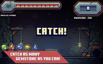
Are you ready to catch gemstones? Don't you wanna miss them?
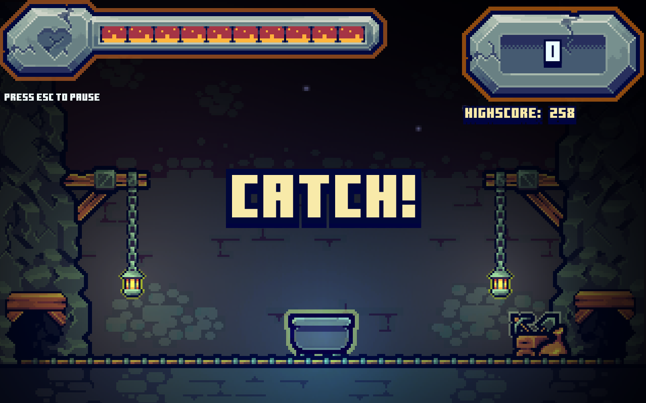
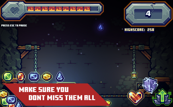
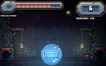
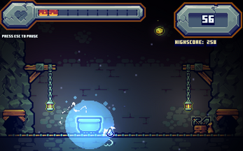
Don't miss is a simple mini gemstone catch game where your goal is to catch you have to catch gemstones as many as you can, once you miss, your health will be reduced, so Don't Miss it or you'll lose it!

In this mini game, your objective is to collect gemstones falling from above, make sure you don't miss each one of the gemstone falling otherwise it will reduce your health which would cause you to lose the game.
WINNING CONDITIONS
There are no winning conditions about this game, because in this game is more about competing yourself, beat your highscore and surpass your limits! Learn from your mistakes and know how to adapt.
CONTROLS
- A or Left Arrow Key - Move to left
- D or Right Arrow Key - Move to Right
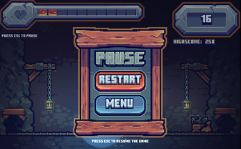
- ESC - Pause or Resume the game

KINDS OF GEMSTONES
Don't expect your catching only one type of gemstone. There are five types of gemstones in this game and they are known as Emeralds, Rubies, Blue Sapphires, Yellow Sapphires, and Tanzanites, some gemstones might be beautiful than others and some are not look valuable but it doesn't mean they don't share the same values. In this game, value about gemstones doesn't matter, don't judge the book by it's cover and always catch them all as long as you don't miss them!

BEWARE OF FALLING STALACTITES
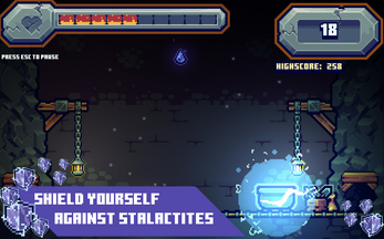
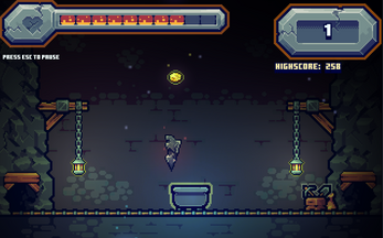
Try not to expect catching gemstone is an easy task, you are in a cave and stalactites are anywhere in the area. Falling stalactites will cause damage to your cart and it will reduce your health until it reaches to no more room to your health bar, which can cause you to lose the game. Catching stalactite is like petting a piranha, learn how to be alert to your senses when something danger is in coming!

KINDS OF POWERUPS
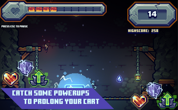
There are three kinds of powerups in the game, and they are known as Heart regeneration, Shield activation, and Team Up activation.
Heart Gemstone
- Heart Gemstones, also known as heart regeneration powerup, can heal your cart health with 2 points each time you catch the powerup itself.
Shield Powerup
- Shield Activation allows you to protect yourself against falling stalactites. It serve as an energy that coats the cart like a protective aura that can obliterate dangerous stalactites that can cause damage to the cart. Having some cool protective aura around the cart doesn't make you cool that can destroy stalactites, because it doesn't protect you if you miss some falling gemstones, which can cause damage to your health bar, so never forget your task and catch!
Team Up Powerup
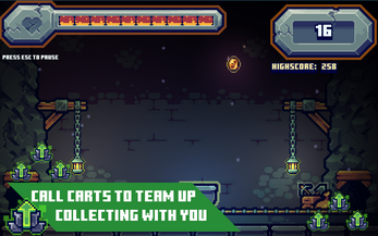
- You are not alone in the mining area, you should also call some help! Team up activation is a powerup that can let you call other carts to collect the gemstones which you have missed, so you can't get damaged if you missed some gemstones. Think about like you are a plate and the powerup serve as a tray which you stand on. Team Up Powerup has an advantage of an effect that won't let you get harmed if you missed a gemstone, but the disadvantage is it doesn't protect you from falling stalactites!

CREDITS
A game and featuring design, art, and code by Jerico, also known as OwllCraft
Sound effects are from
https://www.zapsplat.com
Contributors
Thanks to Anant Ray, Mad Eriksen, also known as Darth Glonk, and A5^CERVO for testing the game.

Social Medias
Twitter: https://twitter.com/OwllCraft

This is my very first game I have ever made in my game development experience. Any Feedback Is Appreciated, thank you! If you don't mind, feel free to share your high score which you gained in the game! Show how awesome you are! :)
If you enjoyed my game, feel free to leave a rating!
Original Release: November 4 2020
Download
Development log
- Don't Miss Version 1.1 UpdateNov 08, 2020

Comments
Log in with itch.io to leave a comment.
awesome art style!
Thank you, I appreciate it. :D
Really nice game!
Hey, happy that you are updating the game, and I like most of what I'm seeing.
What I liked:
- The new store page background and images in the description, really nice touches and well made.
- The first screenshot. It is probably too subtle for a gif, but it's still good.
- The game seems easier now, did you make something with the random generation? The gems stopped spawn too far away and are now easier to catch.
- The powerups, I didn't find them too useful, but it's refreshing to see something different now and then.
What I disliked:
- The image at the top. It is just a screen, you can do better. And remember to upload it as a banner, to get all the top. You can do it by visiting the "Edit theme" menu.
- The oversaturated screenshots 2 to 6. You have put too many overlays and they are really repetitive.
- The screenshots text. Too simple, since I know you can come up with something way better, I'm a bit disappointed to see just a simple rhombus.
- The screenshots above the 7th, they are no more necessary in my opinion.
- The 2 builds, better to have an option to toggle between windowed and fullscreen.
- Still no settings to mute the game.
Bugs:
- The green powerups are defined as help to collect the gems (screenshot), but from what I experience, the additional carts act just as a shield preventing you from losing HP.
Anyway, nice update and keep up with the good work
// Matteo
Thank you for your feedback. I'm still new when it comes to game developing and this is my first game I've made actually, and I really still need much to learn.
I appreciate it! And it really helps me to improve more and learn a lot. I noted some things to improve. :)
the game is really fun, but u need to make a difficulty, and i can't open it in a full screen, the game would be really fun on android, really nice game, and really cool pixel arts, really recommend everyone to try it
Thank you for your feedback, I appreciate it! There will be a full screen version of Don't Miss game in the next update and there will be new features as well. :D
Great job, since I have a lot to say I'll try to be brief
Starting with the Itch.io page, which is good, but can be improved. Your game works well with GIFs, so I recommend that you introduce at least one in your screenshots. Also, the look of the page would improve with a large logo and background, like in these other games:
https://ko-op.itch.io/dep-nocturne
https://terrycavanagh.itch.io/dicey-dungeons
Unfortunately, the game font is really difficult to read, perhaps due to the size of the window. And this causes problems in understanding the help panel, mainly due to the difficulty of recognizing the controls compared to the rest of the text. I recommend using a different colour or font to highlight them. Nice idea to insert links to social media in the credits.
The text you use to explain the game is perhaps too long and sometimes redundant. You could try reducing it, like in this attempt I made:
"Catch as many gemstones as you can, each one missed will reduce your health. Good luck."
As the game is built for PC, it would be a nice addition to be able to return to the menu using the ESC (from panels such as help and credits), rather than having to click the 'back' button.
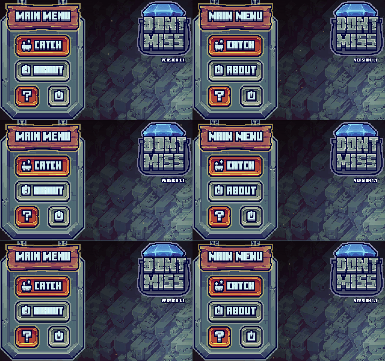
Following long-established practices, the button to close the game should be coloured red. Also, its icon is too similar to that of the credits, I recommend changing one of the two.
Nice custom intro, with the game logo.
Adding options to change the sounds or increase the window size would improve the gaming experience.
I recommend creating a button for the resume in-game.
If you apply any of my suggestions, remember to update the Itch.io page.
That's it, thanks for sharing your game with the community and good luck.
I see, thanks for your feedback and I appreciate it. :)
it is a great
and a hard game
i seriously recommend you to try it
i thought i would just leave it after 1 go
but when i tried it
i somehow spent an hour on it
i feel like just trying one more time
it is a great game, the gameplay is hard
the sound effects are okay
and the art is awesomeee!!
i am seriously telling you go try it you will like it
my highest score is 108 (i dont know why i am writing this)